How to Use Data Science to Understand What Makes Wine Taste Good
A company needs data as a sword needs whetstone if it is to keep its edge
- 🗓️ Date:
- ⏱️ Time to read:
Table of Contents
Note: You can read this same article in Free Code Camp’s Medium Publication.
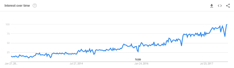
Data Science. It's been touted as the sexiest job of the 21st century. Everyone — from companies to individuals — is trying to understand it and adopt it. And if you're a programmer, you most definitely are experiencing FoMo (Fear of missing out)! Just look at how popular the term has become over time:
The average salary of a data scientist is over $120,000 in the United States according to Indeed. They also currently have the highest paid jobs, with a median of $60k. Glassdoor also named it the “Best job of 2016”, and it’s also been ranked the number one job on Glassdoor.
But what’s this science that they keep talking about?
What’s the need for Data Science?
To put it simply, Data Science helps you be data-driven. Data-driven decisions help companies understand their customers better and build great businesses.
We live in the age of information explosion. Companies collect different kinds of data depending upon the type of business they run. For example — for a retail store, the data could be about the kinds of products that its customers buy over time, and their spending amounts. For Netflix, it could be about what shows most of their users watch or like and their demographics.
Business decisions often rely on lots of intuition and domain knowledge. Now, as data grows larger and larger, it becomes difficult for us to make sense of it. We simply aren’t equipped with the mental faculty to pour over large data-sets filled with tons of information.
The purpose of Data Science is to tell you a story and help you visualize it.
Using it you can:
- Get lot more insights from the data, that could otherwise go undetected
- Make faster decisions, because well — computers are faster than humans after all!
- Eliminate a lot of bias that goes behind decision making. Throughout history, humans have always been quite prone to letting their feelings and prejudices cloud their judgement…

But unlike humans, computers don’t need to sit in a business meeting and get into a pissing contest about why a certain decision is better than the others.
Now that we have understood what it’s all about, it’s time to learn it!
Who will get the most out of this tutorial:
- People with some basic knowledge in programming, who want to understand data science and its applications.
- People who find math and statistics a little overwhelming in the beginning.
- If you’re even remotely interested in wines, then read it — just for the heck of it!
Let’s get Started!
In this tutorial, you’ll understand how to analyze a wine data-set, observe its features, and extract different insights from it. After finishing this tutorial, you’ll:
- Understand how Data Science can be used to analyze and get insights from data.
- Become knowledgeable about wine. ;-)

Even if you don’t drink, that’s all-right — you’ll still become a budding Sommelier, or Oenophile (yes, that’s an actual term!).
In the next blog post, you’ll see applied data science in the form of machine learning:
- What is ML, and what kinds of problems can be solved using it?
- How to train a classifier using ML to identify good wines from bad wines.
- Different performance metrics
Know before you read:
I’m assuming that you already have some knowledge of programming. Some programming knowledge of Python is necessary, so if you know it, you’ll find this tutorial relatively simple. If you don’t, I highly recommend that you check out this free course on Introduction to Python.
Why Python? Because it is fast emerging as the preferred choice of language for data science. It is fairly easy to pick up and learn, and the Python ecosystem has a lot of tools and libraries for virtually building anything — ranging from web servers, packages for machine learning, statistics, deep learning, to IoT. Python has also one of the most active communities on the internet, like stack overflow.
Some basic knowledge of libraries like numpy and pandas will also be helpful, although not compulsory.
What you’ll need for this tutorial:
- Preferably, a Linux based distro (Ubuntu or Linux Mint) with Python installed.
- Install Anaconda. It’s an open-source package management system and environment management system, primarily for Python programs. For training and testing our machine learning models, you will be using a very popular open source library called scikit-learn.
- Download the project files from this repository into your machine. Then open up a terminal,
cdto your project folder, and runpip install -r requirements.txtto install the dependencies.
You’ll be using an IPython (Interactive Python) notebook file to run your code. After downloading the project files, open up your terminal, cd to your project folder, and run jupyter-notebook. This will open a new window on your default browser on the port 8888. If you’re using FloydHub, the same notebook file can be run from there as well.
You’ll find two IPython notebook files. Select the one named game-of-wines.ipynb from the list. The other notebook file contains the full source code for this tutorial.
How to use this notebook
The notebook already has some template code and explanations inside cells for you to get started. At a few places, you’ll find that code has already been written for you, just to make it easier. You’ll also find comments and links wherever necessary.
To execute code in a cell, click on it with your mouse, then select the run option on the title bar of the book.
Alright, Cheers! Let’s sip… whoops, study our wine data.
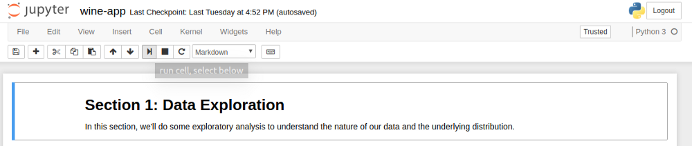
Data Exploration & Descriptive Statistics
I was searching on the internet the other day for some interesting open-source data. Kaggle has a very active community where you can easily search for different kinds of data-sets and solve challenges. Another awesome place to look for data-sets is The University of California Irvine’s Machine Learning Repository.
The UCI Machine Learning repository has two sets of wine data. One dataset contains information on red wines, and the other for white wines. Your project folder already contains both of them. These wines were produced at Vinho Verde, a region on the north of Portugal.
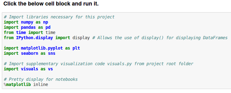
First, you’ll import some libraries needed for our data analysis. Click on the cell block, then select the run command to load all of them.
Next, we’ll load our data-set into our notebook and display the first 5 columns. Type this code in the cell block of your notebook and then run it:
# Load the Red Wines dataset
data = pd.read_csv("data/winequality-red.csv", sep=';')

# Display the first five records
display(data.head(n=5))
It’ll print this output:
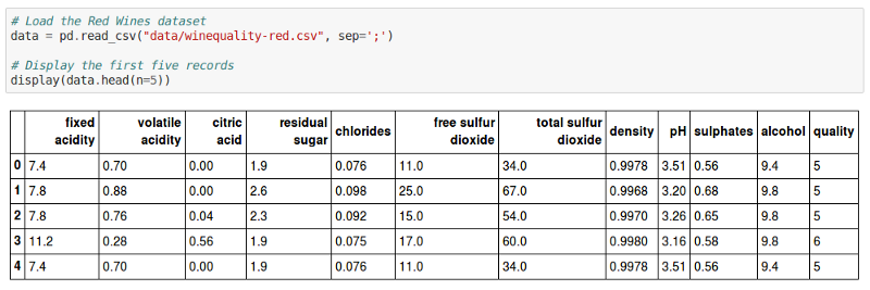
As you can see, there are about 12 different features for each wine in the data-set. The last column, quality, is a metric of how good a specific wine was rated to be, between 1 to 10.
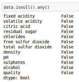
Let’s see if any of these columns have missing information. Type this in the cell block:
data.isnull().any()
The output shows us that no columns are empty.
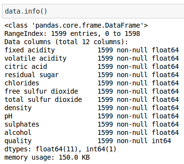
We can get some more additional information on our data-set by running:
data.info()
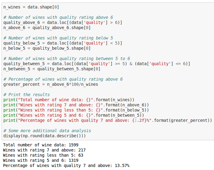
Let’s try performing some preliminary analysis on our wines. For our purposes, let’s consider all wines with ratings 7 and above to be of very good quality, wines with 5 and 6 to be of average quality, and wines less than 5 to be of insipid quality:
n_wines = data.shape[0]

# Number of wines with quality rating above 6
quality_above_6 = data.loc[(data['quality'] > 6)]
n_above_6 = quality_above_6.shape[0]

# Number of wines with quality rating below 5
quality_below_5 = data.loc[(data['quality'] < 5)]
n_below_5 = quality_below_5.shape[0]

# Number of wines with quality rating between 5 to 6
quality_between_5 = data.loc[(data['quality'] >= 5) & (data['quality'] <= 6)]
n_between_5 = quality_between_5.shape[0]

# Percentage of wines with quality rating above 6
greater_percent = n_above_6*100/n_wines

# Print the results
print("Total number of wine data: {}".format(n_wines))
print("Wines with rating 7 and above: {}".format(n_above_6))
print("Wines with rating less than 5: {}".format(n_below_5))
print("Wines with rating 5 and 6: {}".format(n_between_5))
print("Percentage of wines with quality 7 and above: {:.2f}%".format(greater_percent))
Some additional data analysis
display(np.round(data.describe()))
You can also view the distributions in quality on a graph:
# Visualize skewed continuous features of original data
vs.distribution(data, "quality")
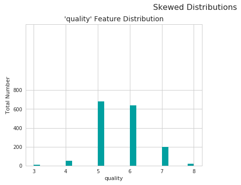
As you can see, most wines fall under the average quality. There are fewer wines that are of very high quality and great tasting, and very few wines that aren’t so good.
We can also use pandas describe method to get useful statistics, such as mean, median and standard deviation of the features in our data:
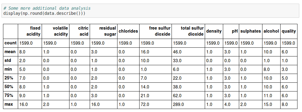
Some useful statistics that you should know about:
- Mean (Average): Perhaps the most familiar one of all. Just add up all the sample values for a given feature, then divide it by the number of samples.
- Median: First you arrange all the sample values in numerical order, in a list. The middle number in this list will be the median.
- Mode: The value that occurs the most in a list of samples.
- Range: The difference between the highest value and the lowest values in a list.
- Standard Deviation: It is used to measure the dispersion of values in a set. First calculate the mean, then subtract each number in the list with the mean and square the result. Then calculate the mean of those squared differences, and finally calculate the square root of it.
Now, the next step is to study the features in our data-set in more detail.
The quality of wine depends upon a bunch of chemical properties that affect their taste, aroma and flavor. So yes, even though wine making is considered an art, it’s actually pretty scientific if you think about it.
In Data Science, having domain knowledge can be the key differentiating factor between mediocre and great insights.
Domain Knowledge
Time to get wiser with our wine vocab!
Wines contain varying proportions of sugars, alcohol, organic acids, salts from mineral and organic acids, phenolic compounds, pigments, nitrogenous substances, pectins, gums, mucilage, volatile aromatic compounds (esters, aldehydes and ketones), vitamins, salts and sulfur dioxide.
In wine tasting, the term acidity refers to the fresh, tart and sour attributes of the wine. Three primary acids are found in wine grapes — tartaric, malic and citric acids. They are evaluated in relation to how well the acidity balances out the sweetness and bitter components of the wine, such as tannins.
- Fixed Acidity
Titratable acidity, sometimes referred to as fixed acidity, is a measurement of the total concentration of titratable acids and free hydrogen ions present in your wine. A litmus paper can be used to identify whether a given solution is acidic or basic. The most common titratable acids are tartaric, malic, citric and carbonic acid. These acids, along with many more in smaller quantities, either occur naturally in the grapes or are created through the fermentation process.
- Volatile Acidity
Volatile acidity is mostly caused by bacteria in the wine creating acetic acid — the acid that gives vinegar its characteristic flavor and aroma — and its byproduct, ethyl acetate. Volatile acidity could be an indicator of spoilage, or errors in the manufacturing processes — caused by things like damaged grapes, wine exposed to air, and so on. This causes acetic acid bacteria to enter and thrive, and give rise to unpleasant tastes and smells. Wine experts can often tell this just by smelling it!
- Citric Acid
Citric acid is generally found in very small quantities in wine grapes. It acts as a preservative and is added to wines to increase acidity, complement a specific flavor or prevent ferric hazes. It can be added to finished wines to increase acidity and give a “fresh” flavor. Excess addition, however, can ruin the taste.
- Residual Sugars
Residual Sugar, or RS for short, refers to any natural grape sugars that are leftover after fermentation ceases (whether on purpose or not). The juice of wine grapes starts out intensely sweet, and fermentation uses up that sugar as the yeasts feast upon it.
During winemaking, yeast typically converts all the sugar into alcohol making a dry wine. However, sometimes not all the sugar is fermented by the yeast, leaving some sweetness leftover.
To make a wine that tastes good, the key is to have a perfect balance between the sweetness and the sourness in the drink.
- Chlorides
The amount of chlorides present in a wine is usually an indicator of its “saltiness.” This is usually influenced by the territory where the wine grapes grew, cultivation methods, and also the grape type. Too much saltiness is considered undesirable. The right proportion can make the wine more savory.
- Sulphur Dioxide levels
Sulfur dioxide exists in wine in free and bound forms, and the combinations are referred to as total SO2. It’s the most common preservative used, usually added by wine makers to protect the wine from negative effects of exposure to air and oxygen. Wines with added sulphur dioxide contents usually have “Contains Sulphites” on their labels.
It acts as a sanitizing agent — adding it usually kills unwanted bacteria or yeast that might enter the wine and spoil its taste and aroma. It was first used in winemaking by the Romans, when they discovered that burning sulfur candles inside empty wine vessels keeps them fresh and free from vinegar smell. Pretty neat, huh?
- Density
Also known as specific gravity, it can be used to measure the alcohol concentration in wines. During fermentation, the sugar in the juice is converted into ethanol with carbon dioxide as a waste gas. Monitoring the density during the process allows for optimal control of this conversion step for highest quality wines. Sweeter wines generally have higher densities.
- pH
pH stands for power of hydrogen, which is a measurement of the hydrogen ion concentration in the solution. Generally, solutions with a pH value less than 7 are considered acidic, with some of the strongest acids being close to 0. Solutions above 7 are considered alkaline or basic. The pH value of water is 7, as it is neither an acid nor a base.
- Sulphates
Sulfates are salts of sulfuric acid. They aren’t involved in wine production, but some beer makers use calcium sulfate — also known as brewers’ gypsum — tocorrect mineral deficiencies in water during the brewing process. It also adds a bit of a “sharp” taste.
- Alcohol
Ah yes, alcohol — the key to a successful party! Alcoholic beverages existed from at least the neolithic period (10,000 BC). Drinking it in small amounts gives you warm fuzzy feelings inside, and makes you more sociable. Of-course, higher doses can also make you pass out.
Booze diligently, my data scientist buddy!
Exploring relationships between features
Now that you have some domain knowledge about wine, it’s time to explore more. Our dataset contains a bunch of features as we saw above, such as alcohol levels, amount of residual sugar and pH value. Some of these features might be dependent on other features, some might not. Some of them might affect our quality ratings too.
In data science or machine learning, it’s quite important to study the features that make up our data and see if there are any co-relations between them.
For example, does pH level affect fixed acidity levels? Do volatile acidity levels have anything to do with the quality? Do people find wines with more alcohol content to be tastier or of better quality?
Lucky for us, Python has awesome libraries that do the heavy lifting of providing different kinds of visualizations.
Data Visualization
Let’s try plotting a scatterplot with our data and observe what what it shows us.
pd.plotting.scatter_matrix(data, alpha = 0.3, figsize = (40,40), diagonal = 'kde');
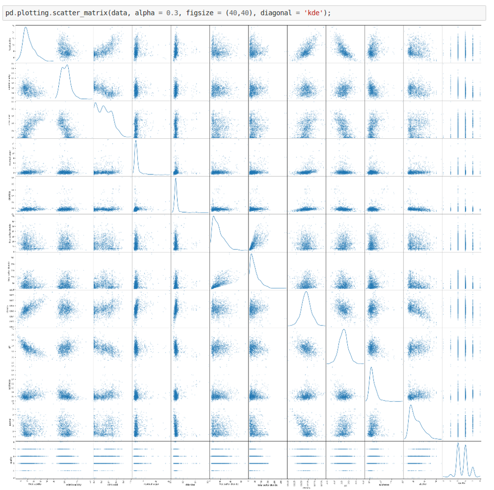
From the above scatterplot we can get some interesting details. For some of the features, the distribution appears to be fairly linear. For some others, the distribution appears to be negatively skewed. So this confirms our initial suspicions — there are indeed some interesting co-dependencies between some of the features.
We can plot a heatmap of co-relations between features, which will help us get more insights.
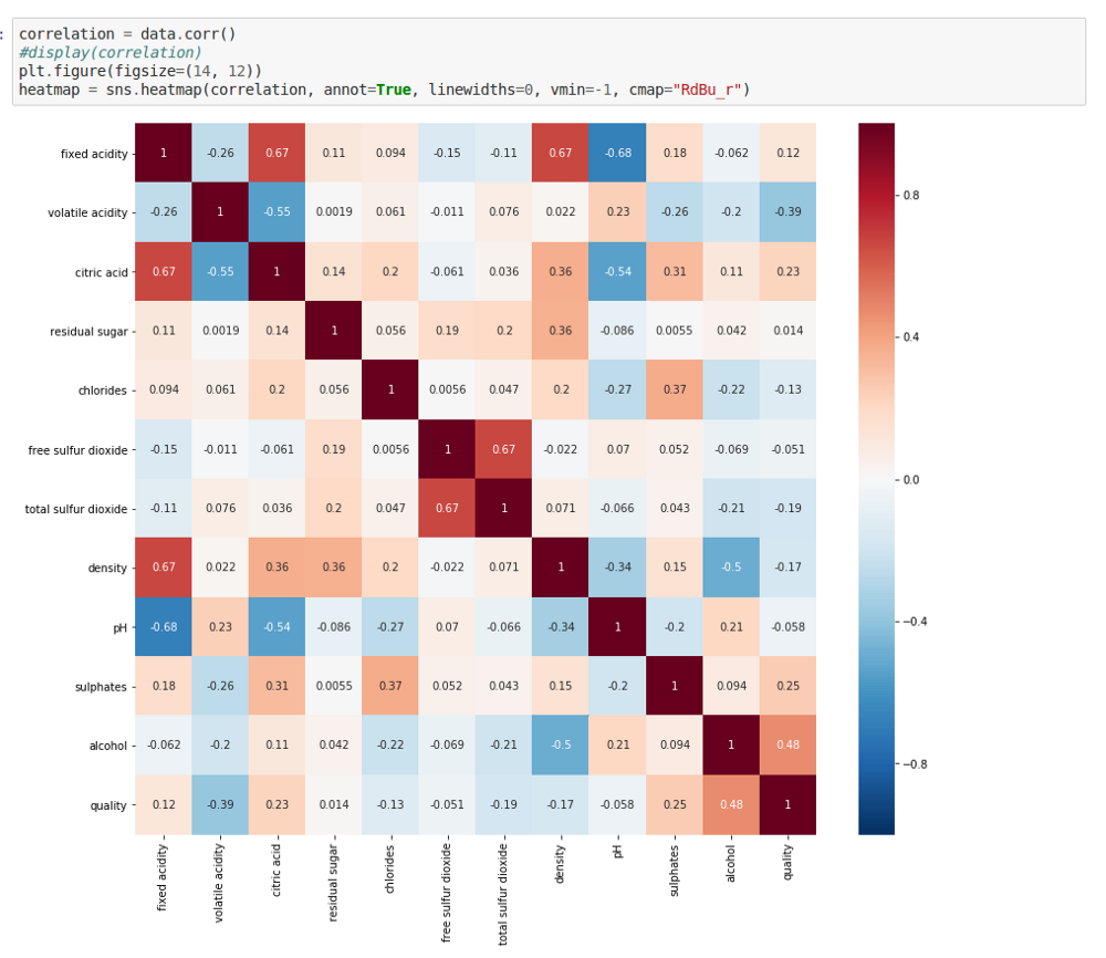
As you can see, the squares with positive values show direct co-relationships between features. The higher the values, the stronger these relationships are — they’ll be more reddish. That means, if one feature increases, the other one also tends to increase, and vice-versa.
The squares that have negative values show an inverse co-relationship. The more negative these values get, the more inversely proportional they are, and they’ll be more blue. This means that if the value of one feature is higher, the value of the other one gets lower.
Finally, squares close to zero indicate almost no co-dependency between those sets of features.
Pretty interesting huh? Let’s explore these co-relationships in more detail.
- pH vs. Fixed Acidity
#Visualize the co-relation between pH and fixed Acidity

#Create a new dataframe containing only pH and fixed acidity columns to visualize their co-relations
fixedAcidity_pH = data[['pH', 'fixed acidity']]

#Initialize a joint-grid with the dataframe, using seaborn library
gridA = sns.JointGrid(x="fixed acidity", y="pH", data=fixedAcidity_pH, size=6)

#Draws a regression plot in the grid
gridA = gridA.plot_joint(sns.regplot, scatter_kws={"s": 10})

#Draws a distribution plot in the same grid
gridA = gridA.plot_marginals(sns.distplot)
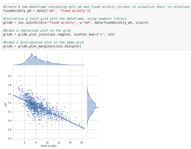
This scatter-plot shows how the values of pH change with changing fixed acidity levels. We can see that, as fixed acidity levels increase, the pH levels drop. Makes sense doesn’t it? A lower pH level is, after all, an indicator of high acidity.
- Fixed Acidity vs. Citric Acid
fixedAcidity_citricAcid = data[['citric acid', 'fixed acidity']]
g = sns.JointGrid(x="fixed acidity", y="citric acid", data=fixedAcidity_citricAcid, size=6)
g = g.plot_joint(sns.regplot, scatter_kws={"s": 10})
g = g.plot_marginals(sns.distplot)
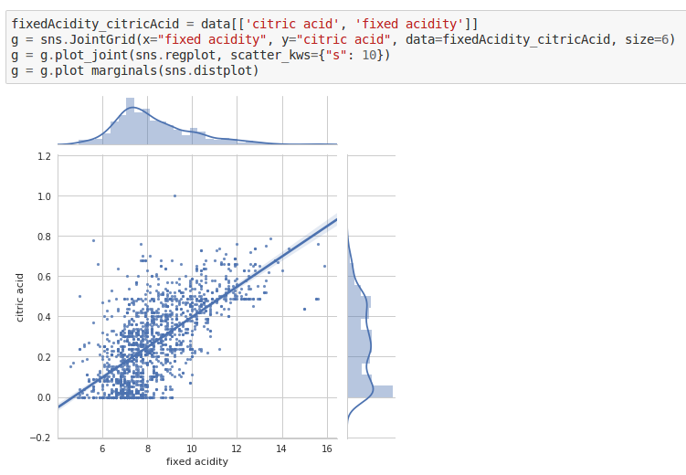
As the amount of citric acids increase, so do the fixed acidity levels.
- Volatile Acidity vs Quality
fig, axs = plt.subplots(ncols=1,figsize=(10,6))
sns.barplot(x='quality', y='volatile acidity', data=volatileAcidity_quality, ax=axs)
plt.title('quality VS volatile acidity')

plt.tight_layout()
plt.show()
plt.gcf().clear()
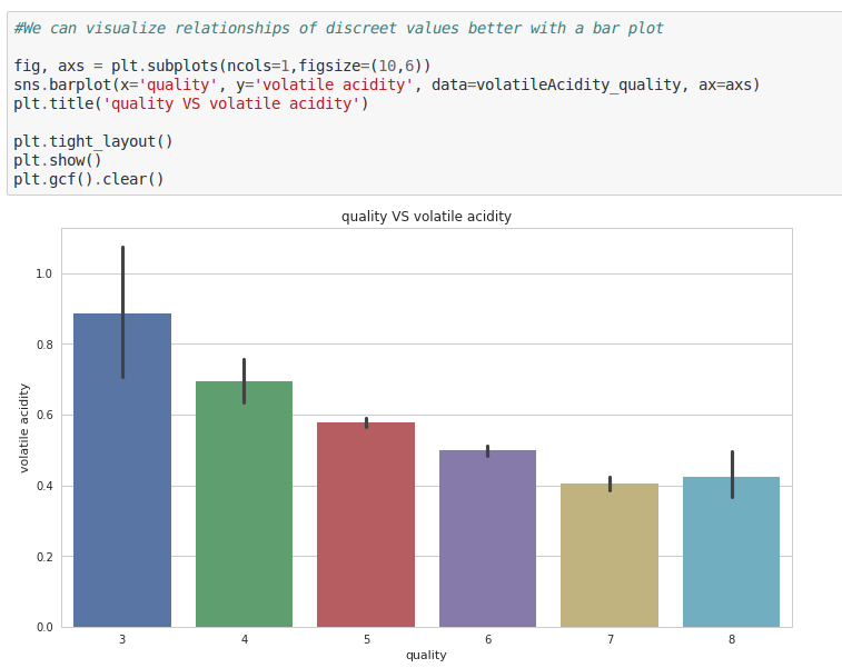
A higher quality is usually associated with low volatile acidity levels. This makes sense, because volatile acidity is an indicator of spoilage and could give rise to unpleasant aromas — consistent with our domain knowledge.
- Alcohol vs. Quality
fig, axs = plt.subplots(ncols=1,figsize=(10,6))
sns.barplot(x='quality', y='alcohol', data=quality_alcohol, ax=axs)
plt.title('quality VS alcohol')

plt.tight_layout()
plt.show()
plt.gcf().clear()
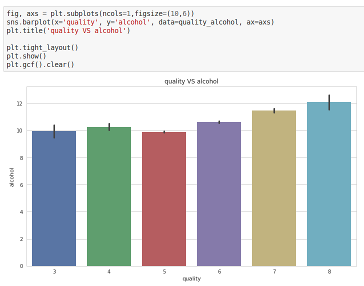
Hmm. Seems like most people generally like wines that contain a higher percentage of alcohol, ones that make them feel woozy!
Try experimenting with more features on your own in the notebook, and see if they reveal anything. If they are related in some way, what do you think might be the reason? Exploring will reveal more hidden insights.
It helps to remember that co-relation does not always imply causation. Sometimes when you plot graphs for two features, it might show you a pattern which might just be a co-incidence.
So why then do we do it? It serves as a helpful ground to see if our data-set’s integrity is intact!
For example, we know for sure that pH levels must decrease if the acidity levels increase. But if our graphs show the opposite, then that’s an indicator that something is amiss — our data-set isn’t reliable. And that could make our predictions wrong! Here’s where having domain knowledge again proves to be helpful.
Outlier Detection
Let’s say in the kingdom of Lannisters, there are about 10,000 adult people. Most of them are of average height (above 5 feet), but there are about a 100 people who are dwarfs. These are also called outliers, because they are extreme values that fall outside of the expected range of heights. In other words, an outlier is a data point that is significantly distant from most other data points.
Why do they matter? Because they can sometimes cause lot of problems in data analysis. Let’s say that you’re trying to calculate the average temperature of 10 randomly selected objects in your room, and nine of them are between 20 and 25 degrees Celsius. But you have left your oven on, and it is at 175 °C. The median temperature will be between 20 and 25 °C, but the mean temperature will be between 35.5 and 40 °C. In this case, the median better reflects the temperature of a randomly sampled object, because that falls under what’s expected in your room.
Hence, finding out Outliers is critical, because very small or very large values can negatively affect our data analysis, and consequently our predictions. So sometimes, it becomes necessary to remove them.

Tukey’s Method for Detecting Outliers
I read a really nice post on this method that you could read later. But in short, here is how the technique works:
- First, you start with dividing the sorted data into four intervals, in such a way that the resulting sections would each contain about 25% of the total data points. The value at which these intervals are split are called Quartiles.
- Then you subtract the 3rd Quartile from the 1st Quartile to get the Interquartile Range (IQR). That’s the middle 50%, and it contains the bulk of the data.
- Any data point that lies beyond 1.5 times the IQR would be considered as an outlier.
Run the following in the next code block to print out outliers for all the features in your data-set.
# For each feature find the data points with extreme high or low values
for feature in data.keys():
    # TODO: Calculate Q1 (25th percentile of the data) for the given feature
    Q1 = np.percentile(data[feature], q=25)

    # TODO: Calculate Q3 (75th percentile of the data) for the given feature
    Q3 = np.percentile(data[feature], q=75)

    # TODO: Use the interquartile range to calculate an outlier step (1.5 times the interquartile range)
    interquartile_range = Q3 - Q1
    step = 1.5 * interquartile_range

    # Display the outliers
    print("Data points considered outliers for the feature '{}':".format(feature))
    display(data[~((data[feature] >= Q1 - step) & (data[feature] <= Q3 + step))])

# OPTIONAL: Select the indices for data points you wish to remove
outliers = []

# Remove the outliers, if any were specified
good_data = data.drop(data.index[outliers]).reset_index(drop = True)
And…we’re done!
I hope you had fun with this tutorial. Now you know more about data science than before!

Of course, there is more to it than meets the eye. If you’d like to know more, I highly recommend that you check these out:
- Statistics and Probability Courses
- Introduction to Python for Data Science
- The Best Data Science Courses on the Internet
- How to become a Data Scientist
But for now, take a break and then head over to the next tutorial, where you’ll dive into some core machine learning stuff. You’ll learn to build a machine learning model, to which if you gave it wine attributes, it would give you an accurate quality rating!
Feel free to leave a comment if you have any questions, or if you’d like a tutorial on a cool topic!